Essay / 13 October 2026 / By: Yoona
"Mickey You’re my Favorite Semiotic Sign of Study" On the Disneyfication of Styling
June 2025. A Reel comes up on my feed of Addison Rae wearing pink sequined Minnie Mouse ears as she talks about idyllic days in Hawaii and Maui Babe’s Browning Lotion. I watch the entire thing waiting for some verbal acknowledgment of the Minnie ears either from her or the interviewer or really anyone in the room. There’s absolutely no mention of it within the video but somebody in the comment section said “Can she let these damn minnie mouse ears GO.”
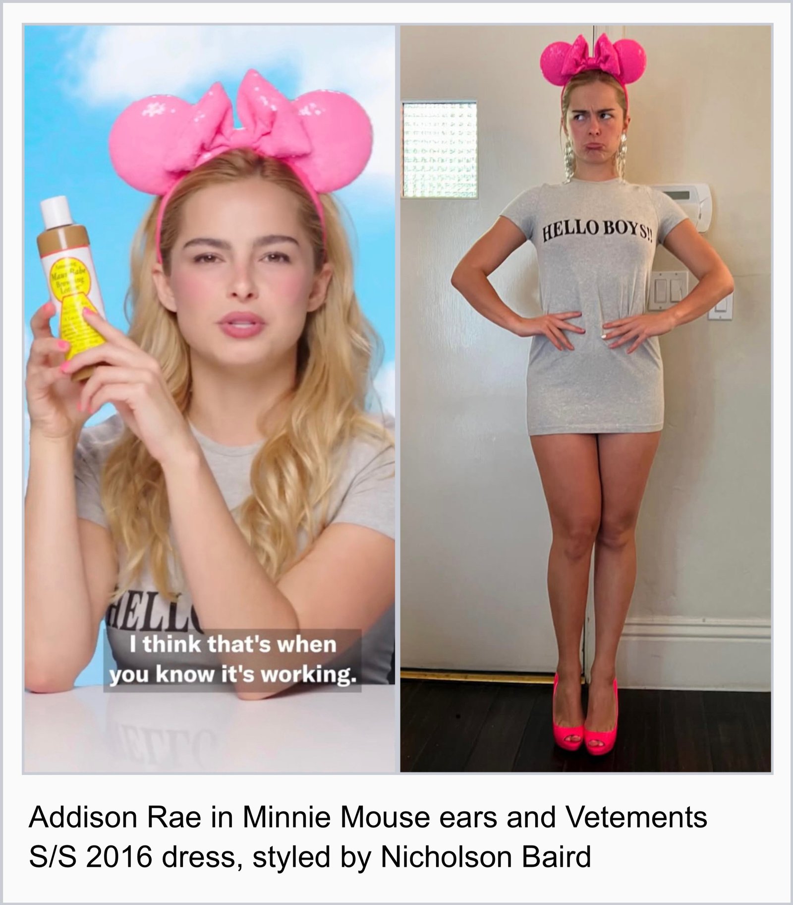
I don’t share the comment’s negativity – in fact, I thought it looked super cute because that shade of pink matched her personal color type (my guess being that she’s a Clear Winter or Bright Spring). But I had a moment of relief like, thank god somebody finally acknowledged the ears?! The presumed normalcy of it was making me feel crazy, when you would think that everybody else treating the Mickey ears as a casual outfit accessory were the ‘crazy’ ones. But is it really all that crazy? If ‘crazy’ means 1. stupid or not reasonable; 2. mentally ill; 3. annoyed or angry (according to Cambridge), then, well, the Mickey-ears-as-casual-accessory aren’t all that. They’re more ‘campy’ than they are ‘crazy,’ but even camp as a descriptive term doesn’t cut as deep as I need it to. To me, the adoption of Mickey ears as a casual styling object is beyond camp: it’s beyond a mere injection of fantasy into the mundane or an occurrence of absurdity made quotidian. It is a sartorial phenomenon that attests to the absurdities of our present milieu.
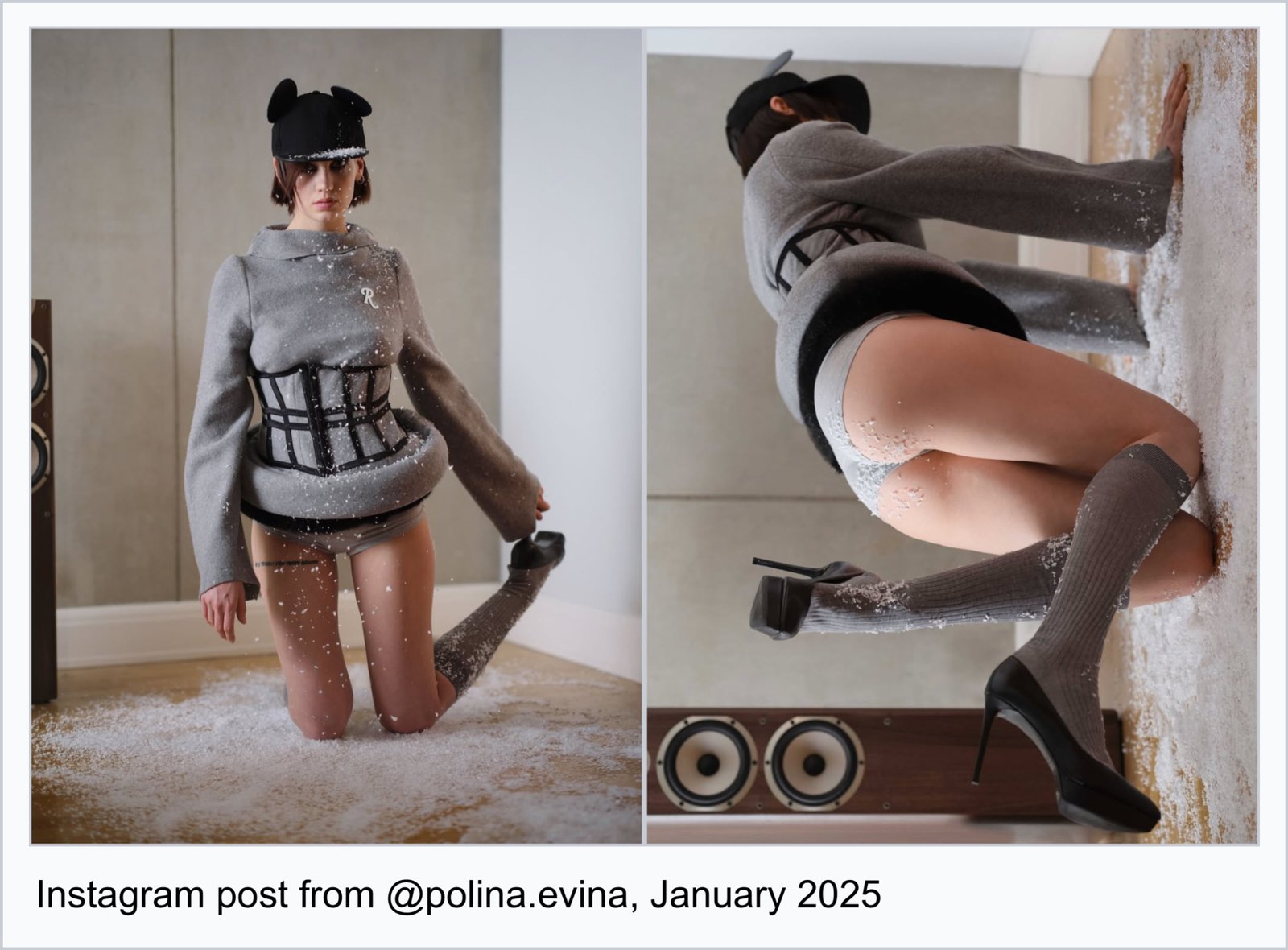
The Disneyfication of styling and contemporary art became more widely visible in the year 2025, but I’d pinpoint 2024 as the beginning of this current wave of it. At the time, I was doing research on the late Americana aesthetic – Disney of course being a significant subsection – and began saving these examples that I’d see in my corner of the Instagram Universe. Consider me your ride operator, and this to be a roughly chronological, cyberethnographic ride through the various Disney motifs that I feel define this moment – a beginning attempt to trace its aesthetic lineage and what it reflects about our cultural psyche… if you will… Seatbelts on!!!
First Stop: A Brief History…
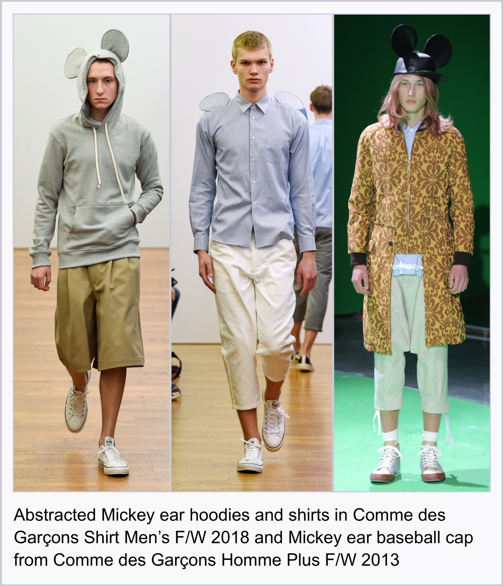
Mickey and Minnie ear headbands originate from a visual gag in the 1929 animated short, The Karnival Kid, in which Mickey Mouse does a gentlemanly tip of the ‘hat’ towards Minnie Mouse using the cap of his head. This silhouette of his ears attached to a bowl-shaped black cap was made into physical headwear for the Mouseketeers in the 1950s TV show The Mickey Mouse Club before becoming the headband we are familiar with today. In Karnival Kid fashion, Rei Kawakubo reimagined the bowl cap silhouette on a wool baseball hat for Comme des Garçons Homme Plus F/W 2013, with the Mickey ears abstracted further in a later collection on hoodies and dress shirts in Comme des Garçons Shirt Men's F/W 2018.
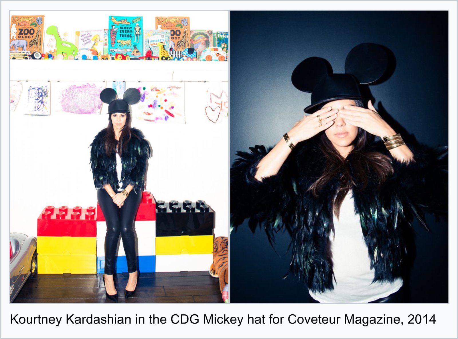
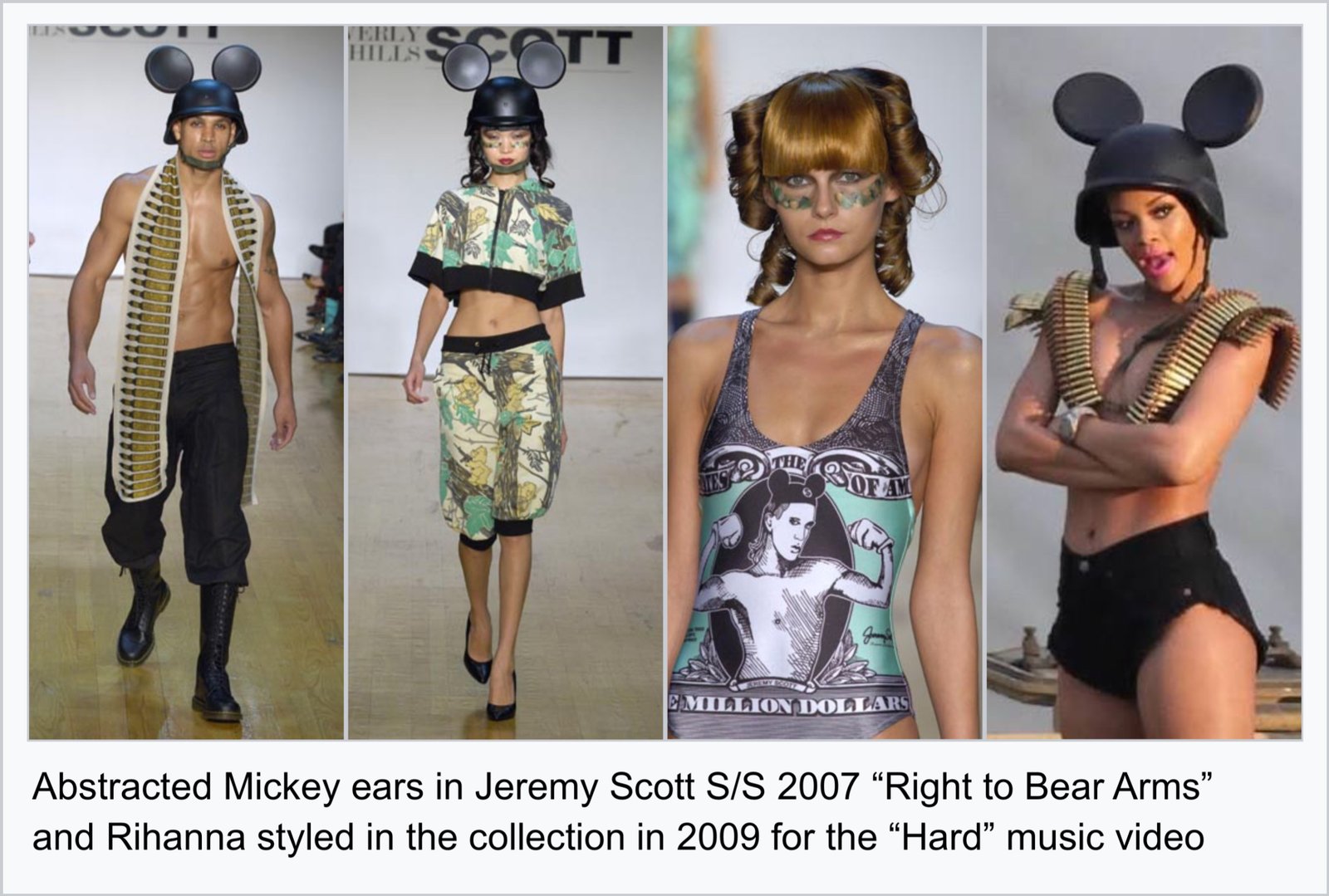
Arguably, the most iconic abstraction of the Mickey ears on the runway is Jeremy Scott’s S/S 2007 collection, “Right to Bear Arms,” which mutated Mickey iconography with militaristic symbols and garb like bandoliers (those cross-body bullet straps), ballistic helmets, and guns shooting out heart-shaped peace signs. In talking about the collection, Jeremy Scott said, “I think the use of iconography is powerful in conveying a clear message: visuals are more instant than words. An image of Mickey Mouse is understood in Mumbai, Timbuktu and Los Angeles in the same way. It’s a clear message even if you subvert it by, say, putting Mickey ears on an army helmet (as I did in 2007). People get it.” The collection is not just a testament to the potency and immediacy of Mickey’s iconography, but it is significant for how it helped set the precedent for abstracting that iconography and subverting it into an edgier, mutated aesthetic form that remains seductive today. Even now, one can post an image of Mickey Mouse with an AK-47 or mutated with some other semiotically-potent symbol like the Chanel logo or marijuana leaf and it would land with an Instagram audience. We witness these aesthetic mutations become archetypal forms in real time.
Snow White and the Tainted Princess
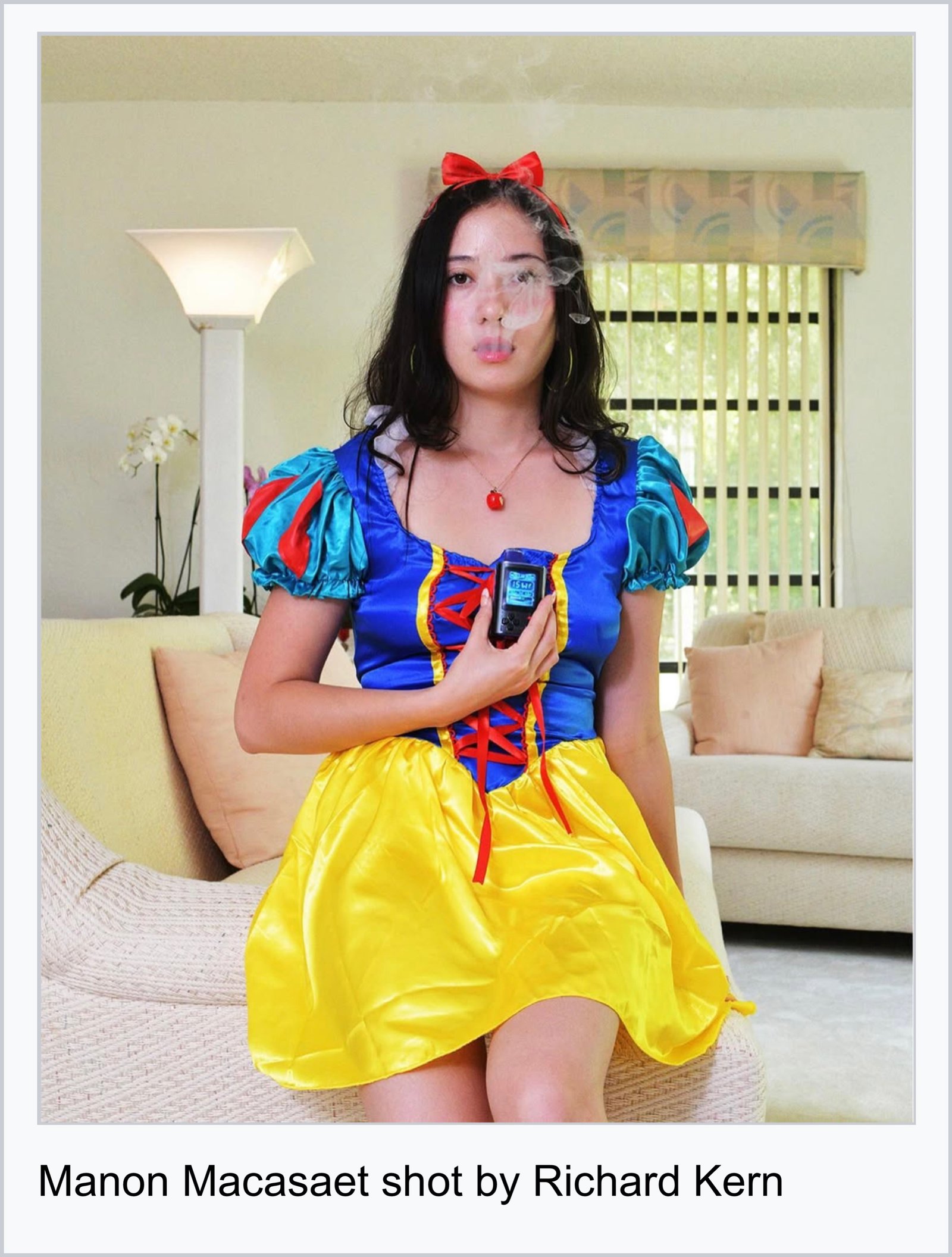
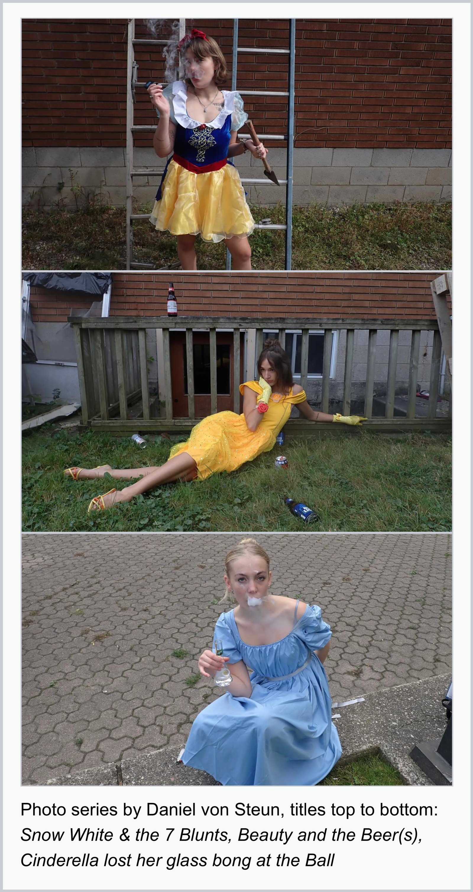
In late 2024, if your Instagram algorithm was in tune with mine, you may have seen these posts of Daniel von Steun’s photo series or Manon Macasaet in a Snow White costume shot by Richard Kern. Both Daniel and Manon’s images take Disney princesses – traditionally symbols of purity, grace and altruistic beauty – as subjects to corrupt. Snow White smoking a blunt, Belle sprawled out amidst a beer-littered post-frat-party-like scene, Cinderella who loses her glass bong instead of a glass slipper at the ball – there’s an undertone of rebellion, defiance, and sexuality. These images call into question what is and isn’t permissible when wearing a Disney costume. The simple act of wearing one as an adult to any of Disney’s theme parks is in fact strictly forbidden for reasons that you can probably imagine, but the most interesting one being for fear of disrupting the illusion and sanctity of the ‘real’ character.
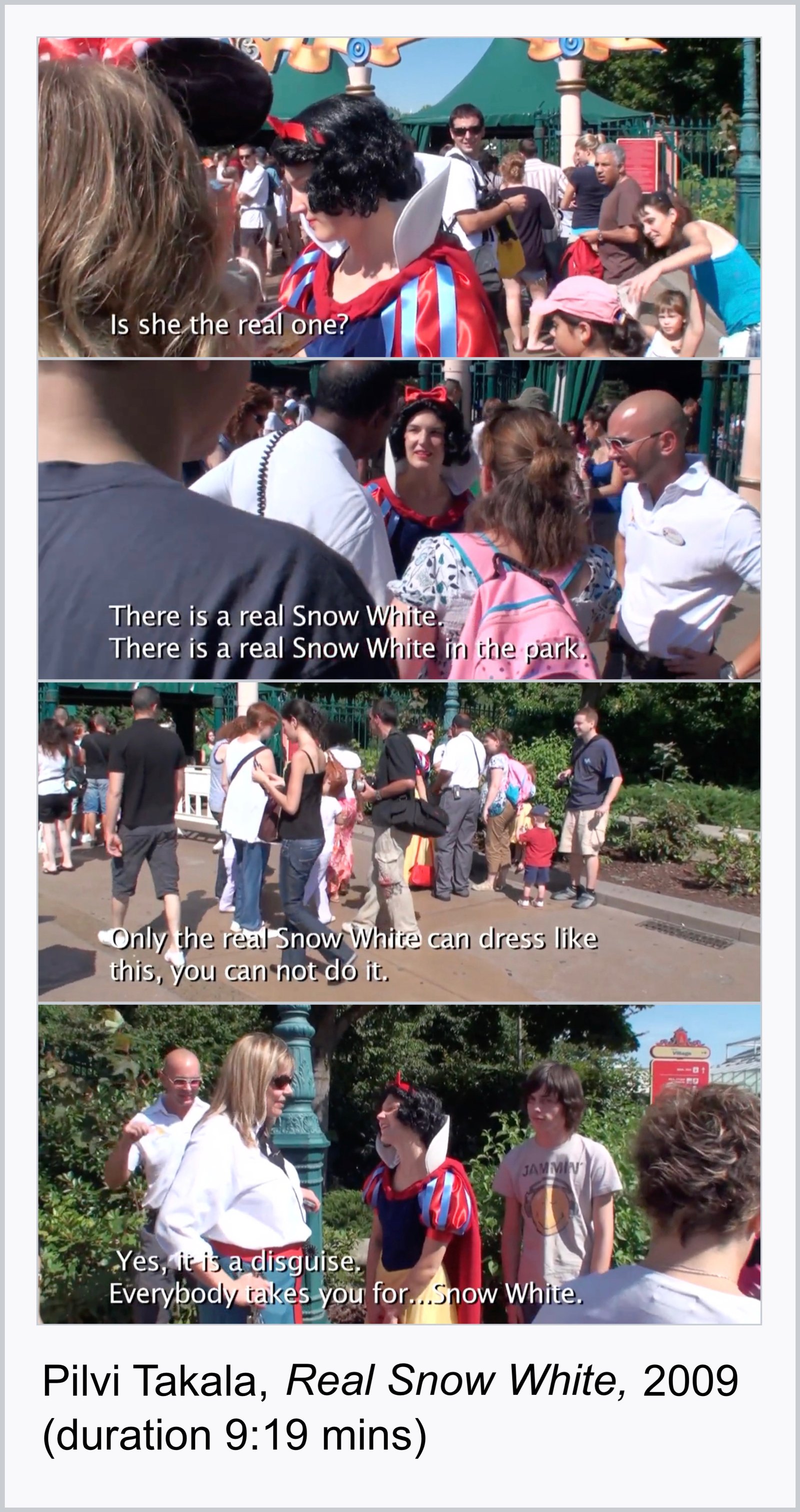
In the 2009 video art piece Real Snow White, Finnish performance artist Pilvi Takala wears a Snow White costume as she attempts to enter Disneyland Paris. Outside the ticketing gates, a crowd of parents and children form around Takala, asking for photographs and autographs. One parent asks, “Is she the real one? She’s so kind.” A guard then pulls Takala aside to explain that she isn’t allowed to enter the park because “it’s about the mix with the real… the real character working here…” More guards come to the scene to tell onlookers that “the real Snow White is inside the park.” Before being escorted to the restroom to change out of the costume, a guard adds that Takala can’t dress as Snow White because the real Snow White can not drink, smoke, or do “bad things.” The conditions of entry prevent the threat of perverting and corrupting the real Snow White, both in imagination and ‘existing’ physically within the park. The costume poses a threat to the realest fake that must eliminate anything realer or as real as it in order to be the most real. What the work best illuminates, however, is how the fantasy of the innocent Snow White doing something bad is so obviously real – realer than Snow White herself. The sartorial proliferation of Disney princess costumes within the Instagram Simulation seemingly leans into this titillation – between real and fake, moral and immoral.
Mickey as Surface Graphic and Jumping Symbol
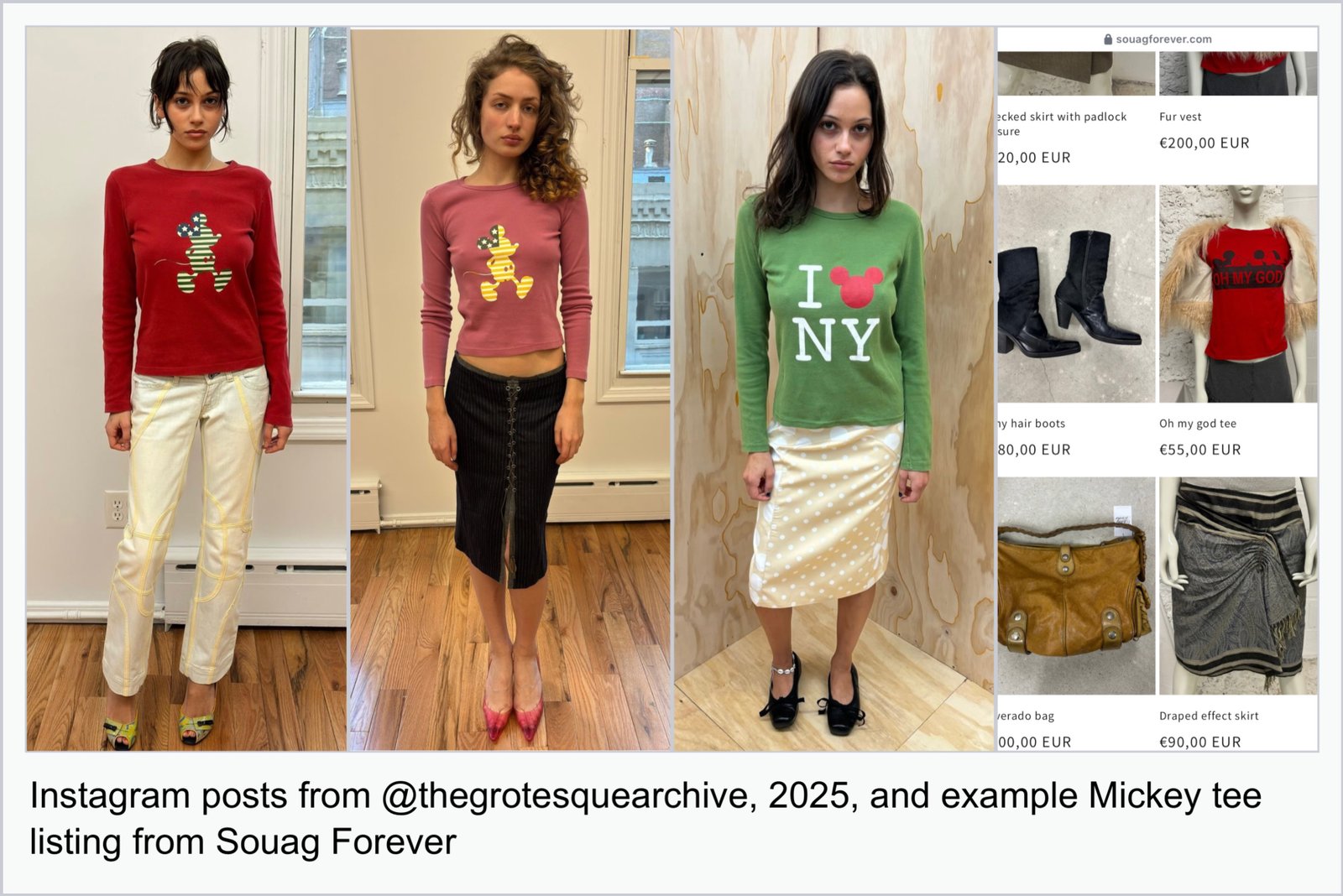
I remember the moment, circa 2025, when I began seeing popular independent stores like Desire Attire and The Grotesque Archive stocking shirts with Mickey graphics on them. Mickey and his little round ears felt like this symbol magically appearing on the surface of these clothes, and thus on the surface of these images, and therefore the surface of my Instagram Simulation in such a way that felt like residual animal tracks across a plain that I was to investigate as clues.
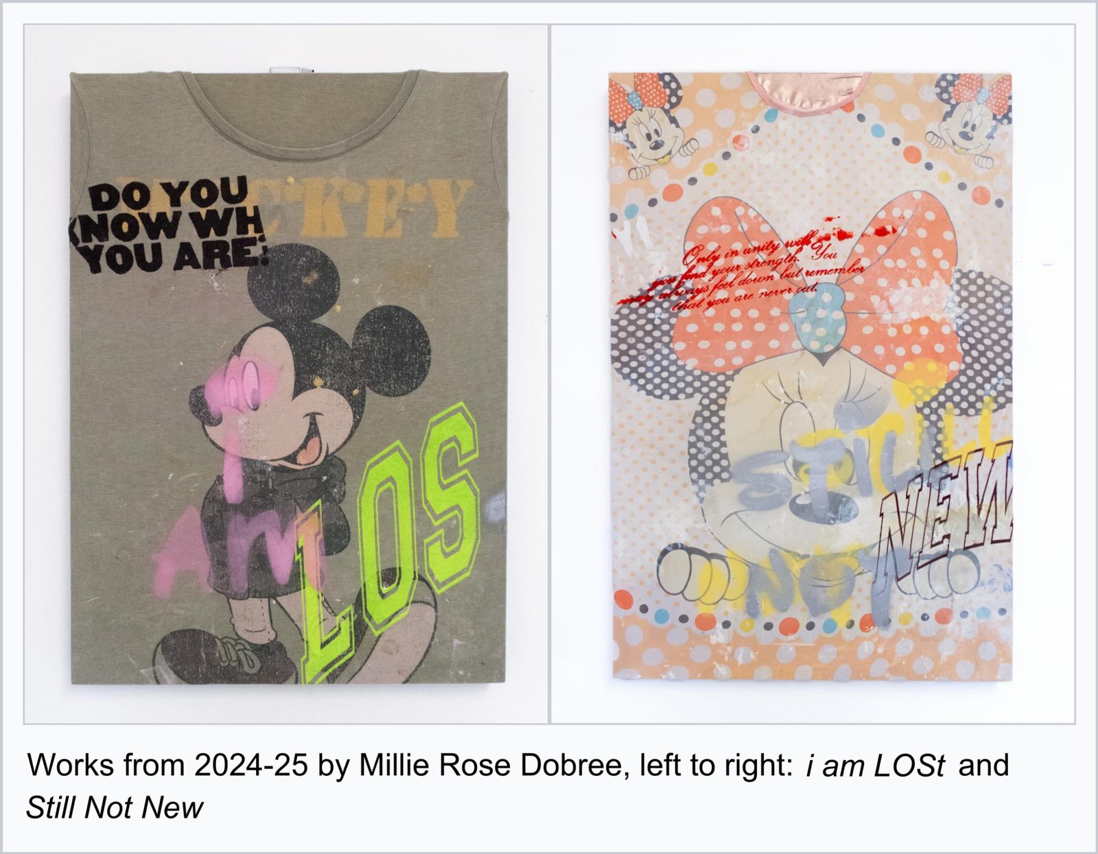
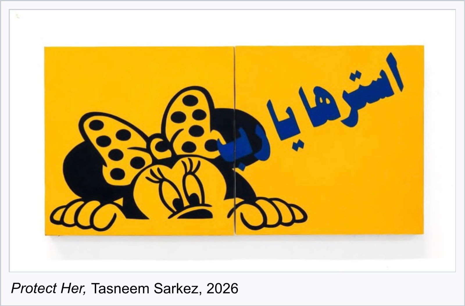
There truly is something magical about the way that a sign ‘jumps’ between material, surfacing and resurfacing out of seemingly nowhere onto vintage tees to contemporary artworks. Works like Millie Rose Dobree’s Still Not New and i am LOSt (both circa 2024-25), and Tasneem Sarkez’s Protect her (2026) pastiche Minnie and Mickey Mouse iconography on their surfaces, and disrupt the subjectivity of their characters. Dobree remixes Disney motifs as a means of remediating the objects that are “predetermined to us as happy,” while Sarkez takes and visually blends the Arabic phrase أسترها يا رب (“Protect her, O Lord”) with Minnie’s image to draw attention to the simultaneous ubiquity yet instability of these cultural registers and how their meanings are constantly recontextualised.
Growing up in Orange County, California, I was always surrounded by the spread of Disneyland’s tentacles that extend beyond its Anaheim city limits. What this materially looked like was Disney merchandise in almost every thrift store you go to, typically children’s clothes and Mickey graphic tees. In Anaheim or even Los Angeles, it’s really common to see, like, a Hispanic middle-aged woman wearing a Mickey tee as just part of her casual outfit. This distinction between Mickey-tee-as-fashion-item in a local fashion context vs. its 2024-2026 Instagram fashion context is a testament to the propensity of Mickey iconography to hold different meanings even when styled in identical ways.
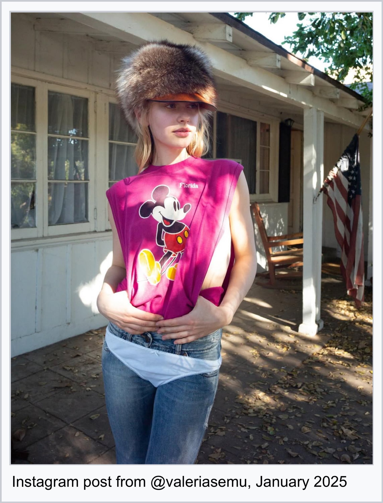
This Era of Instagram Where Everyone’s in Minnie and Mickey Ear Headwear
The aforementioned Instagram comment fatigued by Addison Rae in Minnie ears has most likely seen this post of hers from 2024, as I feel we all may have. Although she certainly wasn’t the first to do it, I will venture to say that there is something about how this specific image operated within the wider Instagram landscape that solidified and legitimised the Minnie ears as a legible styling object.
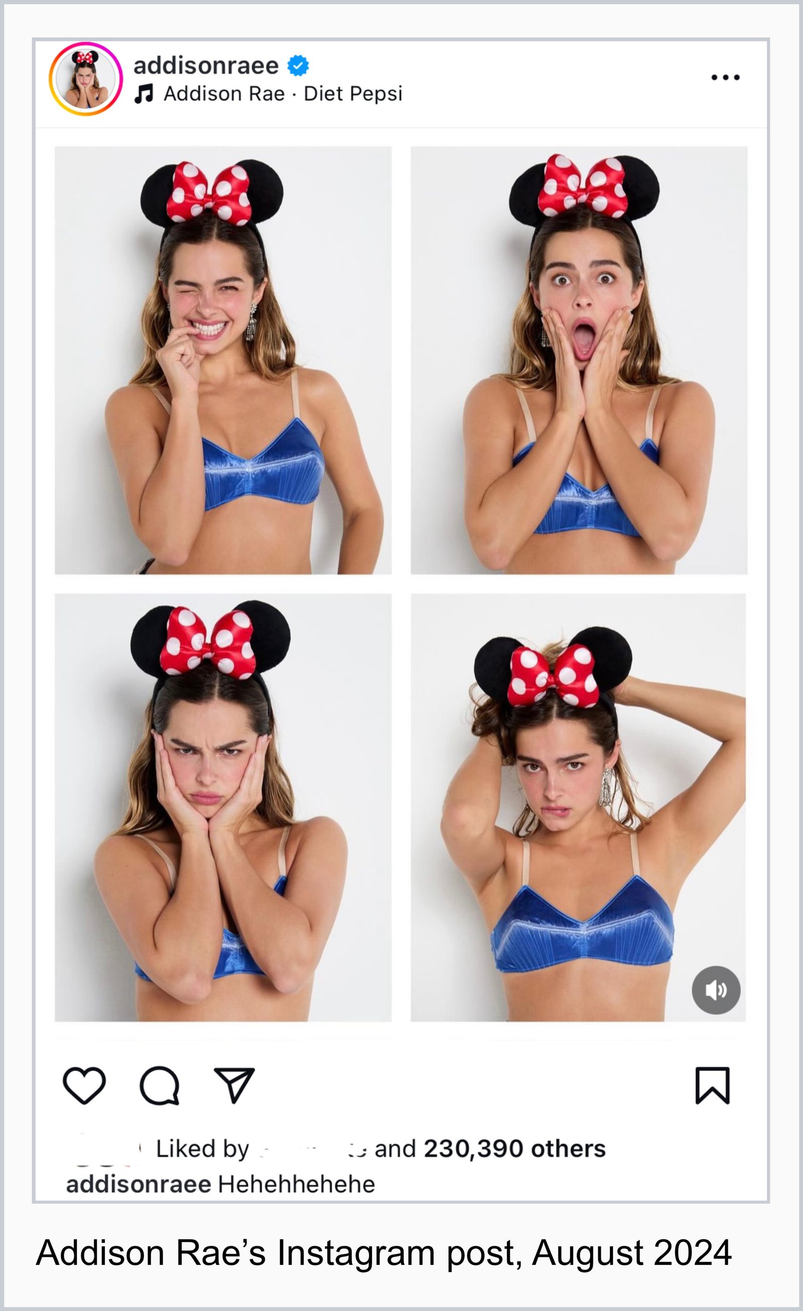
One of the ways a certain style or aesthetic (especially one that is more unconventional like this) is made permissible to a wider audience is through the power of celebrity. There are certain figures whose bodies or image can act as vessels for shifting the connotation of a particular style from weird, kitschy, lame or overly experimental to one that is cute, cool, cunty, campy, or desirable, and therefore emulatable. It’s figures like Lady Gaga, Lana Del Rey, Kate Moss (or even Mickey himself), for example, whose images often circulate within some aesthetic context (e.g. when posted by pages like @bathmat3000 or even certain ‘taste authorities’ like styling / creative directors). I feel this to be a part of the reason why we gravitate towards certain images as vibe-posting favorites like Lana’s Carmen MV outtakes or these paparazzi photos of Elle Fanning that seem to recirculate on my feed every few months. It’s less about these figures being tastemakers themselves and more about how their image functions as a taste-signalling and taste-shifting commodity.
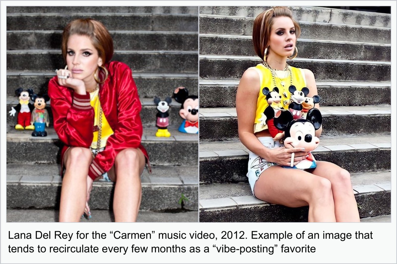
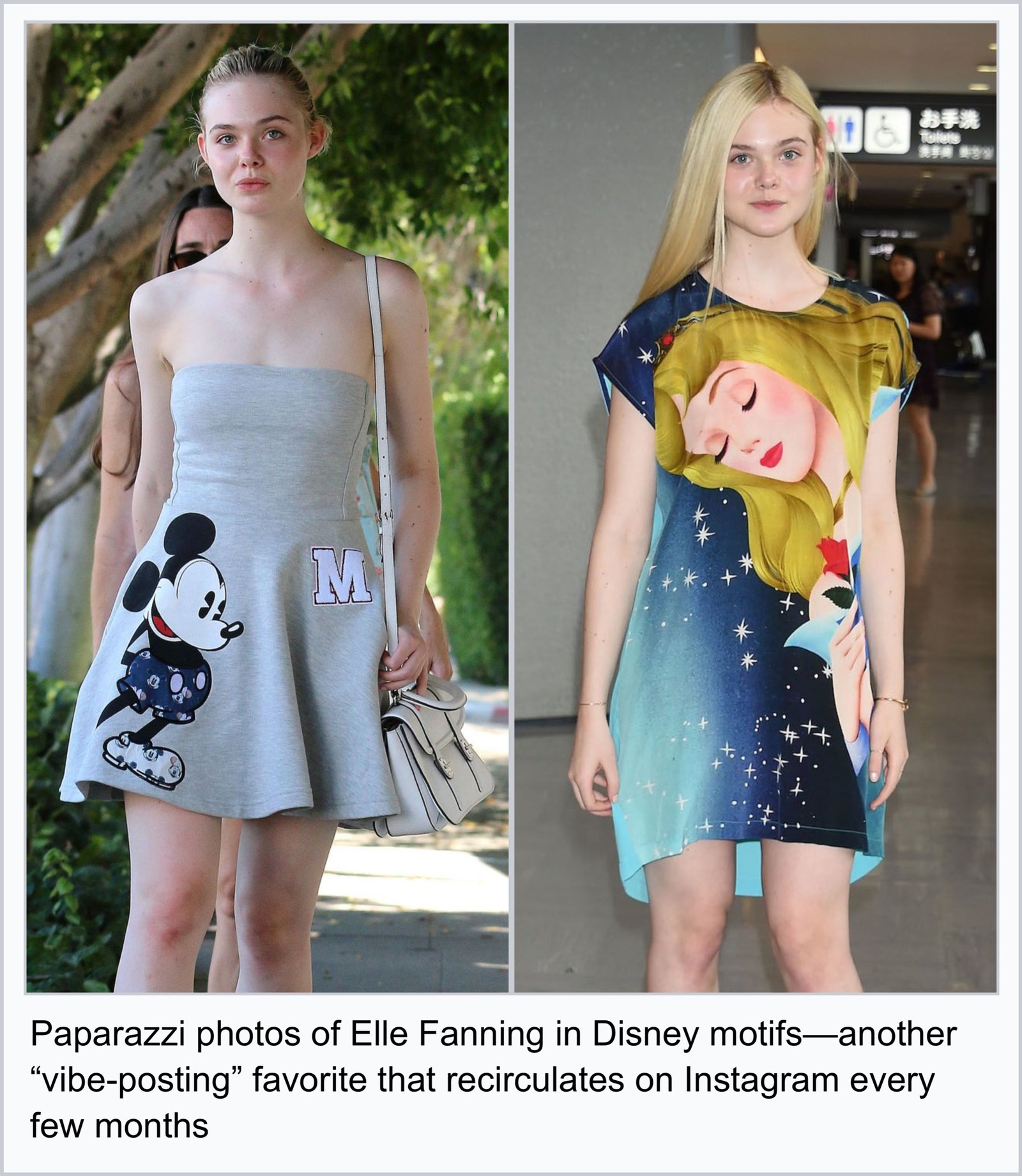
To recirculate these images now (that nostalgically recall the 2010s era of Mickey fashion that ranged from edgy UNIF tees and being the go-to graphic top for millennial fashion bloggers to runway collections like Jean-Charles de Castelbajac's S/S 2012) becomes a way to cash in on its current revival. While I can’t speak for every so-called taste-authority’s motivation for circulating such images, I do think that this ability to be aesthetically literate and to display this image-acumen does lend oneself some form of cultural soft power. At the very least, it’s a means of signaling Yeah I see this Mickey thing happening rn too – that which this essay is admittedly the ultimate embodiment of.
It would be impossible here to cover every interesting aspect of the modern Mickey ear headband – the mind control conspiracy theories, the fervent collector culture, the customisation and knockoff economies, designer collaborations, and so on – though all imbue the ears with different meanings and connotations. In their intended function (their first-order meaning, or denotation as Roland Barthes puts it), the Mickey ear headbands are an essential accessory to wear at Disney’s theme parks. Normally, a souvenir is bought as an after-the-fact object, a token to take home to one’s everyday life to remember a particular moment or place. But the Mickey ear headband is unique as a souvenir that is not just bought after-the-fact but preemptively too, as an accessory to buy at the entrance to wear into the park. It is a peculiar souvenir that enables the ability to consume the memories before having formed them. Of all of Disney’s merchandise, the Mickey ear headbands are possibly the strongest cog in the Disney-as-nostalgia-producing-machine. Irrespective of any original function as souvenir, preemptive-memory-object, or fan accessory, the headbands in contemporary Instagram styling function most as nostalgia-perpetuating, taste-signalling costume.
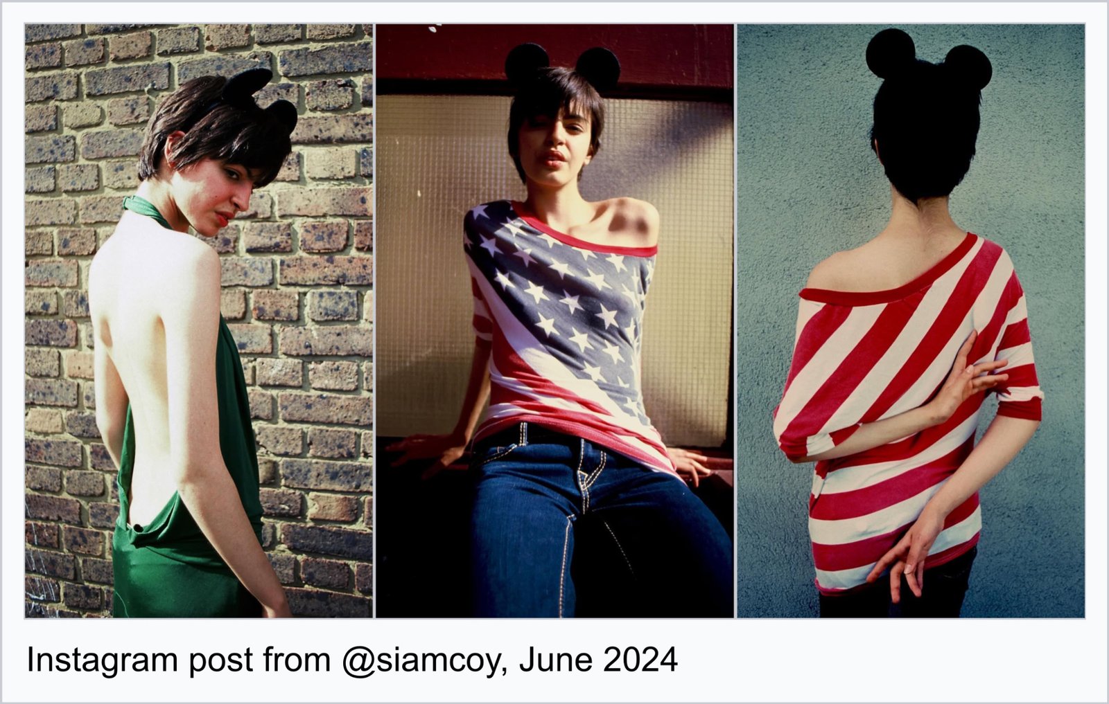
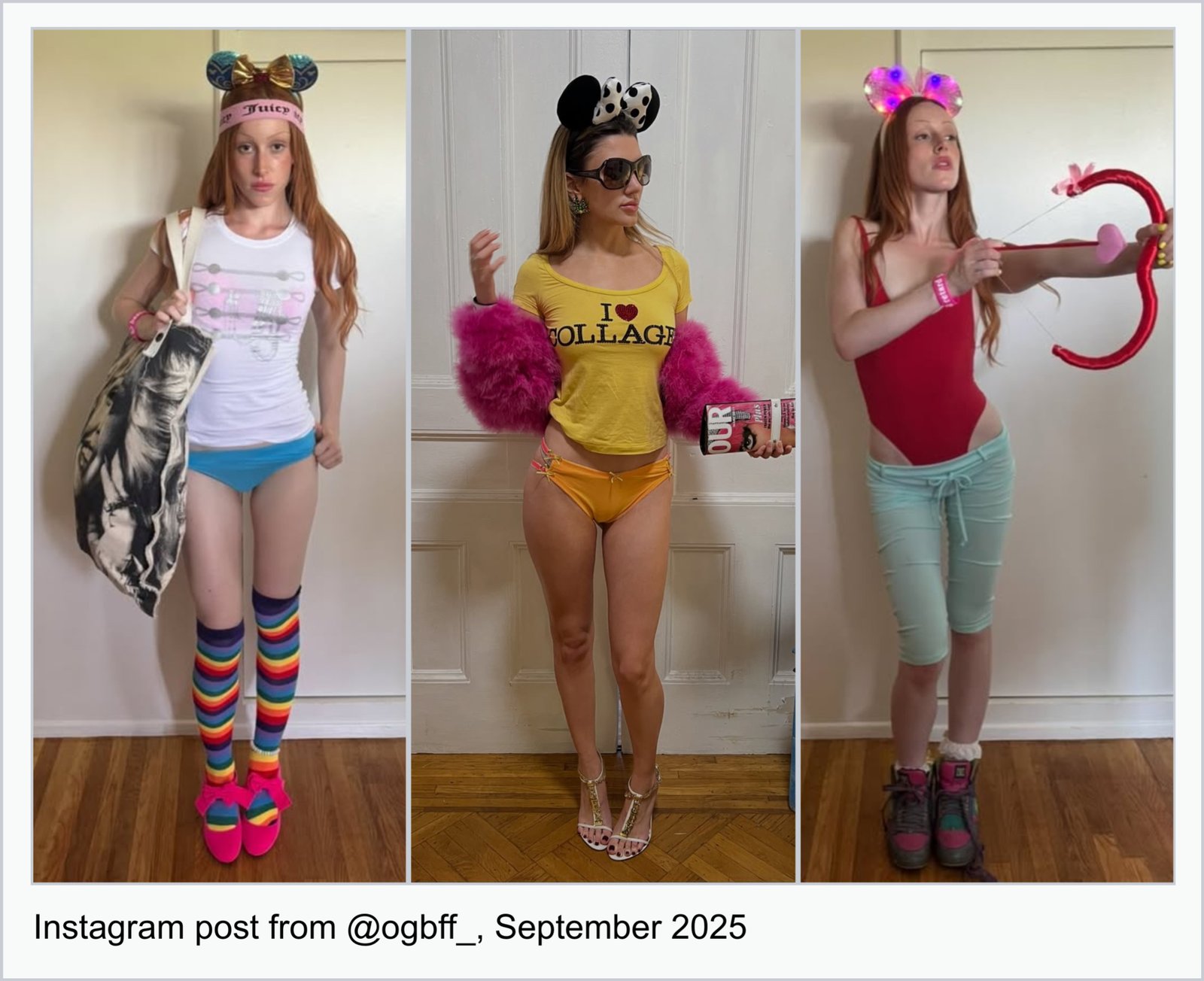
The sartorial proliferation of Disney headwear in recent years evinces a widespread longing for the comfort and psychological sanctuary of the past. In Walt's Utopia: Disneyland and American Mythmaking (2015), cultural mythologist Priscilla Hobbs describes “rejuveniles” as adults who “do not desperately cling to childhood to the point of neurosis, but instead to balance the hardships and monotony of adult life with the playful happiness they remember from childhood. Adults who return to some aspect of their childhood are looking for more than a simple regression. They are hoping to rejuvenate meaning using the tools available.” While the post-2024 Disneyfication of styling isn’t necessarily a phenomenon born from some online army of rejuvenile adults, the point about “rejuvenating meaning” rings true.
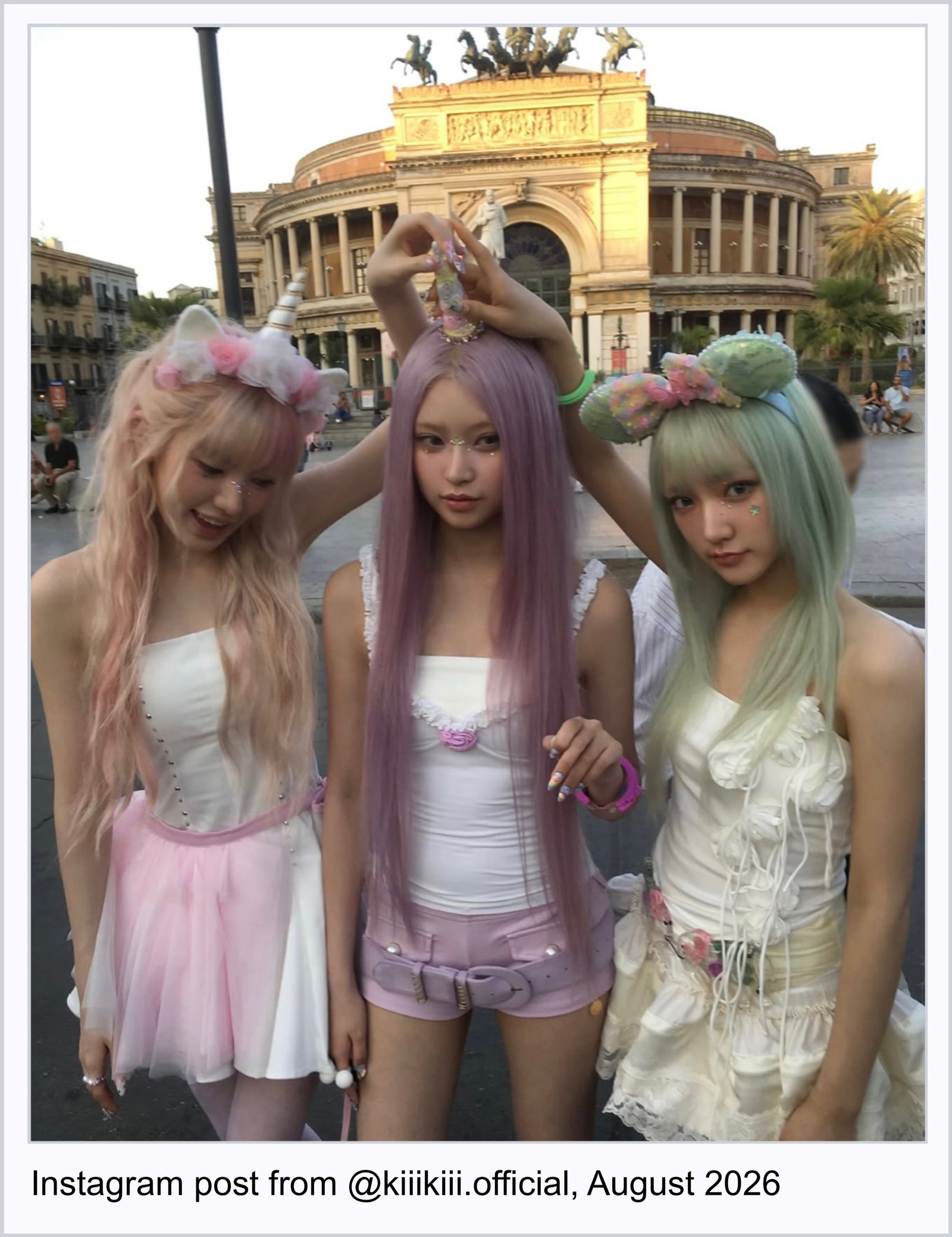
I don’t believe it to be coincidental that the Mickey-ears-as-casual-styling-accessory surfaced as a legible thing [I hate the word “trend”] in 2024 – a year characterised not just by economic stagnation and continued political unrest, but a year whose milieu felt like some post-woke, politically-fatigued rightward swing of the pendulum. All of this amidst the boom in tradwife content, the Labubu craze, Trump’s presidential election win, Brat Summer, Drake vs. Kendrick Lamar beef, and Dubai chocolate slop – a nauseating year of the Internet that felt like some kind of mass cultural psychosis. The gravitation towards a fantastical, absurd accessory makes sense to me within this surreal, blandly-extreme atmosphere. On a political level, I don’t see the Mickey headband as a direct reflection of some nostalgic longing for a ‘better’ America or state of the world (although this certainly is a part of it), but rather a reflection of a collective psyche that may have felt simultaneously manic yet jaded. Throughout 2025 and even now in 2026 (KiiiKiii just posted this pastel Mickey shoot and Cannelle is styled in them for her new Sunshine music video), it doesn’t feel like a surprise to see a new post almost every week implementing Disney motifs in some manner. Its proliferation within the Instagram Simulation is a testament to a shared image reality that speaks to and from this cultural unconscious.
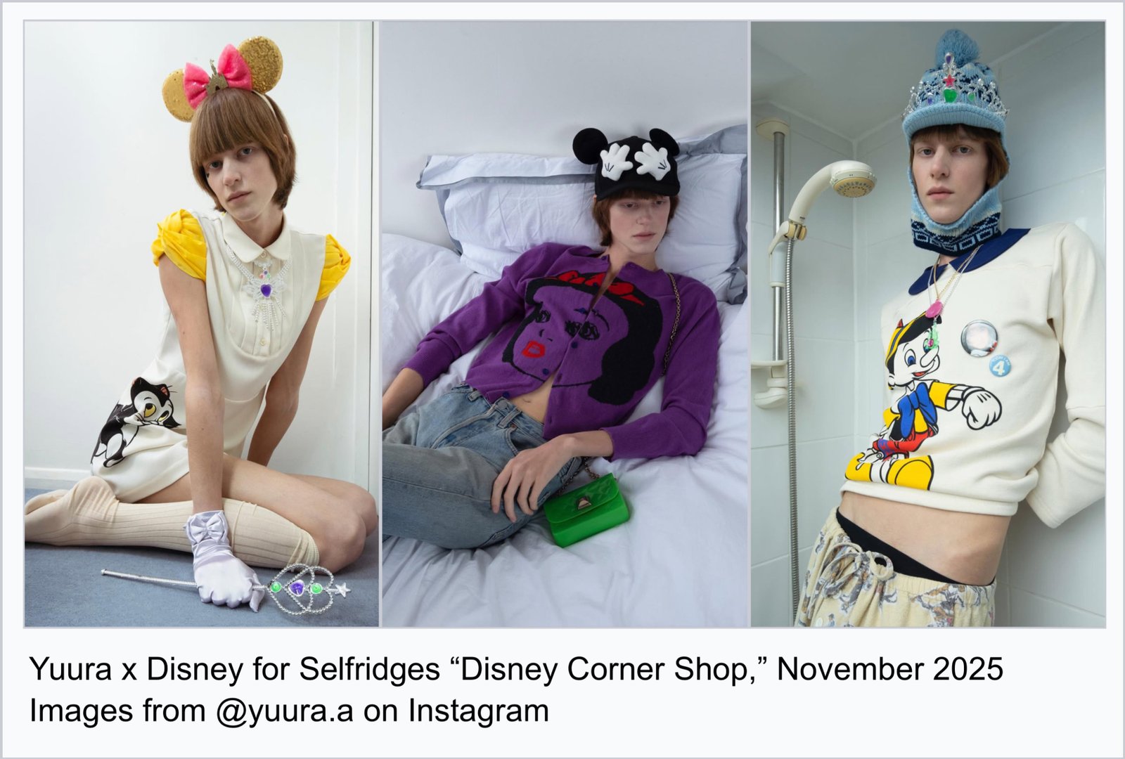
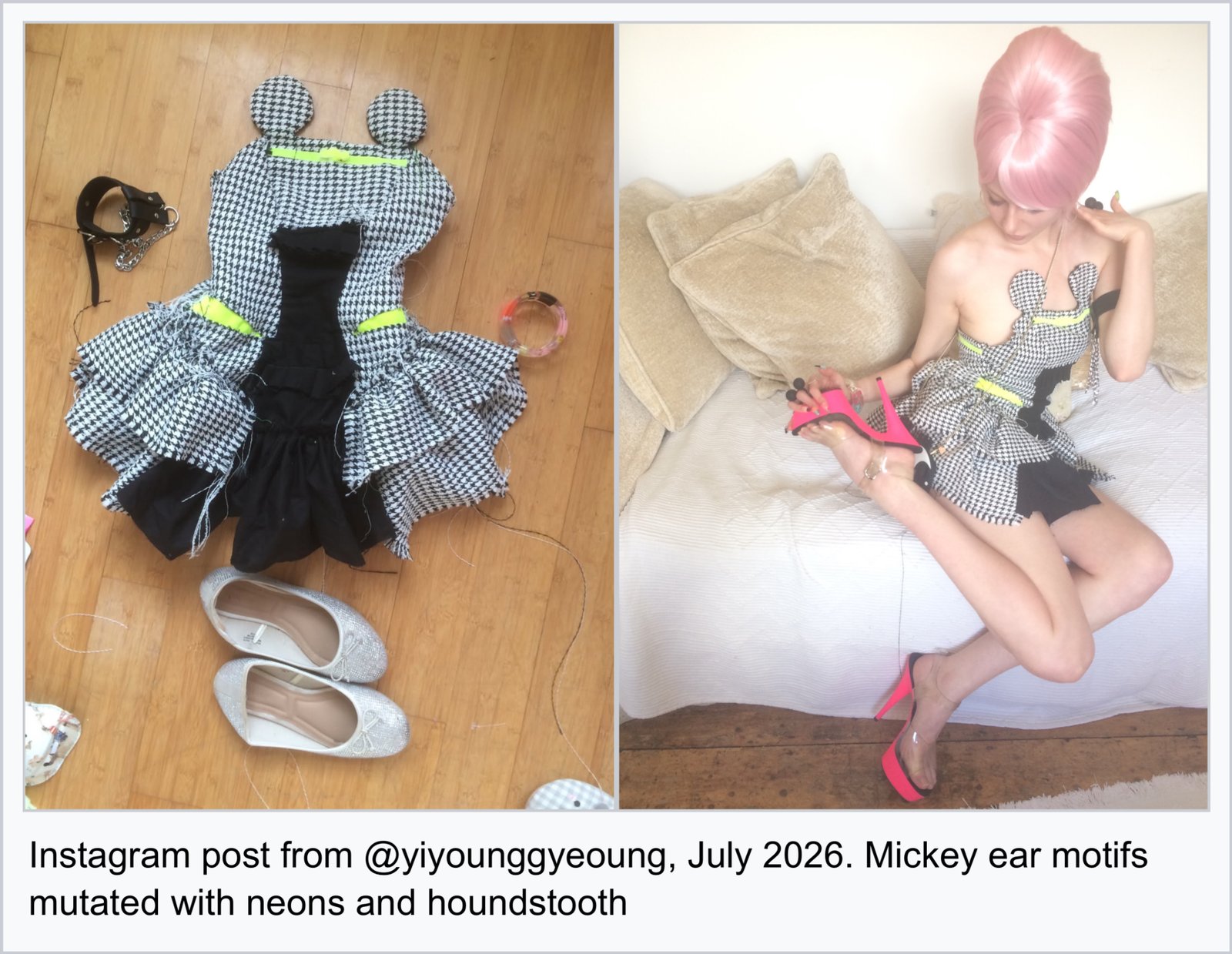
Mickey I’ve Got Your Gloves… And Your Head
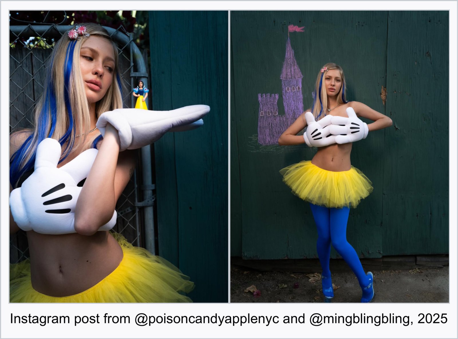
In June 2025, Poison Candy Apple (Manon Macasaet’s brand) posted images of Beanie Boylston styled in the gloves, a yellow tutu, royal blue tights, and peppermint candy hair clips as she holds a miniature figurine of Snow White in her gloved Mickey hands. The outfit’s colorblocking with Snow White’s signature royal blue and yellow is reminiscent of the Disneybounding subculture, in which adults, unable to wear ‘realistic’ costumes to Disney’s theme parks, wear some kind of vague abstraction of the character’s look. Disneybounding adults (who certainly fall into the category of the aforementioned rejuvenile) are often bullied on TikTok by Zoomers and Gen Alpha teens who think it’s cringy and embarrassing, so let me be the first Gen Z-er to come out and say that I think it’s actually really cool and endearing. I am also intrigued by the other photo in the carousel that has Boylston standing in front of a castle drawn in chalk, posed with one gloved hand with the middle finger up and the other atop her chest as if the gloves were a bandeau bra. The middle finger subverts Mickey’s innocence - but perhaps more fascinating is how the gloves visually operate like a bra and how this pose is its own semiotic form.
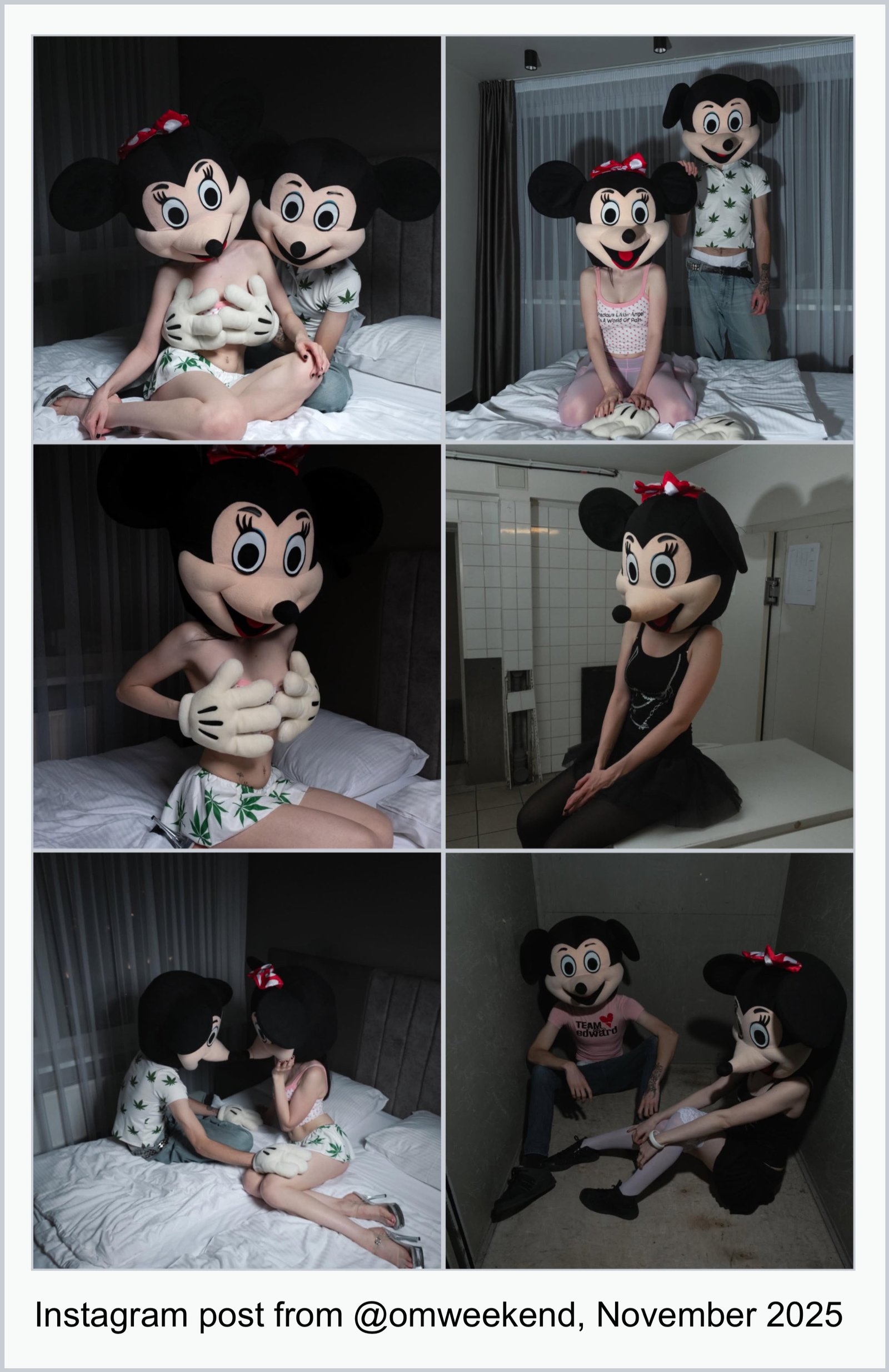
In November 2025, @omweekend posted an intimate Mickey and Minnie Mouse bedroom shoot to promote OMIGHTY’s new pieces. The models wore enlarged costume heads of Mickey and Minnie’s faces, their smiling expressions ominous and creepypasta-ish. ‘Mickey’ reaches from behind ‘Minnie’ to lay his globular, white hands over her chest. Later in the carousel, Minnie sits in a kneeling position with her gloved hands over her pink top that is barely peaking through, rendering the gloves almost into a bra. The pink OMIGHTY top underneath reads “Precious Little Angel In A World Of Pain.” Again, these images are effective because of the underlying, seductive transgression they exude and the edgy perversion of Disney characters. It is this affective quality that can solidify a pose (Mickey’s gloved hands posed over a female chest) into its own aesthetic form that is then further emulated by others.
When I think about the gloves, I’m always reminded of musician and artist Trinity Ace Gardner’s work, whether it be her @dieselsugar Instagram page or image / sculpture works like Lamb (2024) or An Attraction (2025; exhibited in CAMPUS’s recent show “Terror Campaign”). I asked her about her hashtag #MickeyLifestyle, and while she says that it’s somewhat unserious as a joke, I think that its satirical nature makes #MickeyLifestyle – as a hashtag, caption, personal mantra, performance concept and phenomenon – potent.
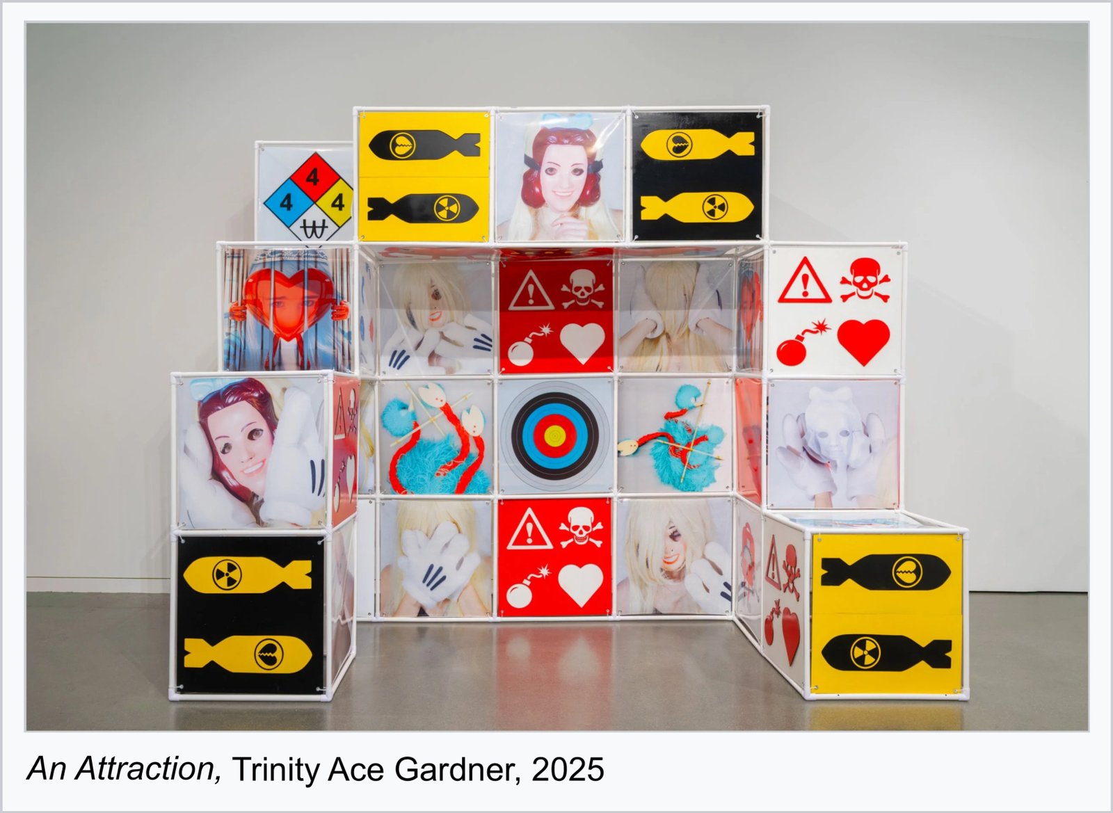
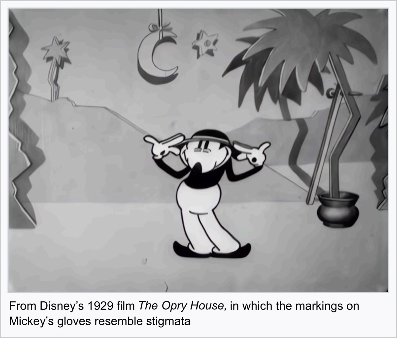
For Gardner, #MickeyLifestyle is about “living while embracing the sacrifice of performance, knowing that once you become an image, you no longer completely belong to yourself, and reveling in the beauty of that.” Mickey is one of the most proliferated icons, endlessly reproduced and projected onto, “in the same way that Christ takes on the burden of humanity… Mickey is the Jesus of America.” In using the gloves in her work, Gardner points to a particularly fascinating aspect of its origins in Disney’s 1929 film The Opry House. At the start, none of the characters are wearing the gloves but upon arrival at the Opry House, Mickey appears on stage with the gloves for the performance as he dances in contorted, bizarre ways under a hypnotic spell. At the end, Mickey awakens from the spell, immediately ashamed at the awareness of his performance, shrinking into himself with his gloved hands over his face. Gardner specifies this moment that we see large, black holes at the palms of Mickey’s gloved hands as significant for how the markings resemble stigmata – the crucifixion wounds of Jesus Christ.
After the Opry House performance, Mickey’s gloves never come off – his performance continuing into perpetuity. The psychological gravitation towards the gloves, heads, and princess costumes in contemporary styling and art are perhaps indicative of a performance fatigue we feel from the constant demands to be online and to perform a self. But it also infers a fatigue from performative wokeness and the hypervisibility of geopolitics (and the subsequent digital activism it demands): Gardner mentions our gravitation to Disney symbols as possibly being “a symptom of the prolonged exposure to the disaffected, nonchalant, irony-ridden affect dominating cultural landscapes online for the past several years. It emerged perhaps as a defensive reaction from a post-pandemic shame, in the wake of our mass cries of care and political engagement going unheard, and an oversaturation of lengthy captions from unqualified sources. Suddenly Paris Hilton, Cheez-It, and your high school bully were all weighing in on the atrocities, signaling their disavowal of the violence committed by the police during BLM. Few were left unscathed by the pressure to publicly signal their wokeness and immense care for the cause out of fear of being perceived as complacent and therefore complicit in the systemic political and racial violence taking place. While many were well-intentioned, many of these cries read as performative in retrospect. Millions who posted the Black Square will take that shit to the grave.”
On our way to the Terror Campaign closing reception, Trinity and I were in my car talking about what it feels like to sniff things out early and for them to become true (exactly as we thought), and the kinds of frustration-like feelings that may come if we feel we didn’t actualize that pseudo-clairvoyance in time, or early enough. We were individually thinking about (and even making work about) things like mint green and Mickey motifs in 2024, and to see them fully fledged in 2026 has this peculiar way of creating these insufferable feelings around publicly caching and actualizing one’s aesthetic literacy or cultural acumen ‘early’. But beyond staking some position as a taste-authority or aesthetically-attuned clairvoyant (neither of us think of ourselves as The Authority anyways and would probably identify more as merely acute observers), I think it’s important to recognise these internal frictions that come with being online—especially within these fashion, music, and art -inclined spheres where aesthetic acumen can lend one power in some way.
The Final Stop of our Ride… Closing Remarks…
While the impetus for writing this essay certainly stems from some self-indulgent motive to make known to the world that I Saw This From Miles Away, the biggest motivation was to write a response to the Dazed article “Was 2025 the year we embraced ‘whimsy’?” The proliferation of Disney motifs in Internet culture is certainly an embrace of whimsy, its softness, hopefulness, and playfulness, and that article associates the trap of nostalgic aestheticism with “whimsy capitalism.” However, we can go beyond mere whimsy. 2025 was the year that the state of our surreal world began to make itself known to us. The Disneyfication of styling can be read as a manifestation of our cultural psyche – one whose delirious, overexposed, hyperconscious, fatigued and jaded unconscious is soothed by the fantastical and the familiar. It is a system of signs at work, materialising themselves in our shared image reality as the residue of our disorienting contemporary life. To look at these images is an attempt to decipher and begin to grasp what it means to observe the surreal milieu of the 21st Century—to feel as if you must be dreaming… Or simply living in Disneyland…